Red, Green, and the Illusion of Control in Transformation Rollouts
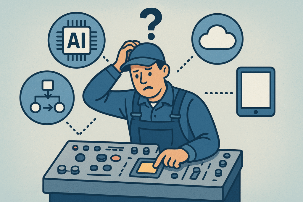
Executive dashboards promise clarity. A simple red-green status indicator can give leaders instant visibility across dozens of transformation initiatives. But when visibility arrives before operational discipline stabilizes, something unexpected happens: teams begin optimizing for the dashboard instead of the work itself. This article examines how that shift happens, and how transformation leaders can design dashboard rollouts that improve governance without creating delivery friction.
The Week the Dashboard Went Live
In a diverse global manufacturer, a new portfolio dashboard went live in Microsoft Power BI.
It was a logical next step. Leadership wanted structured visibility across programs. Project data would flow from Jira, and a clean red/green indicator would provide executive clarity at a glance.
On paper, this was governance maturity. In practice, something else happened: The work hadn’t changed. The visibility had.
And almost overnight, teams began spending significantly more time cleaning up Jira, reconciling data into PowerPoint templates, and joining additional calls to “fix status.”
Nothing accelerates Jira hygiene quite like a red box on an executive dashboard.
This article isn’t about whether dashboards are good or bad. Executive dashboards are powerful tools for transformation governance. Portfolio governance requires structured data. Standardization in Jira was necessary.
But rollout sequencing determines whether visibility creates clarity, or friction.
What Actually Changed on the Ground
Before the Power BI dashboard, projects were delivering work and reporting through a standardized weekly format. It wasn’t chaotic. It wasn’t perfect either with varied Jira standards across teams, but work was moving.
Once the dashboard went live:
- Jira hygiene suddenly became urgent.
- Project data had to align precisely with reporting templates.
- PowerPoint decks were now expected to pull directly from Jira.
- Status calls increased.
- Red indicators became controversial.
Teams weren’t resisting governance. They were responding rationally to incentives.
When a red status is visible to senior leadership, it becomes reputational. Conversations shift from “What risk are we managing?” to “Why is this red?”
When that happens, red stops being diagnostic. It becomes political.
This is where many transformation programs unintentionally create friction.
The Psychology of Red-Green Status Indicators
Binary indicators are attractive. They simplify complexity. They make portfolio governance scalable. They give executives a clean signal across dozens of initiatives.
But delivery environments are rarely binary. An incomplete story in Jira is not automatically a material risk. A documentation lag is not the same as a budget overrun. A workflow inconsistency is not the same as a missed milestone.
Yet in a red/green system, nuance compresses. And when everything imperfect turns red, two things happen:
- Teams optimize for what is visible.
- Leaders feel increased control because they can “see” everything.
But seeing structured data is not the same as controlling outcomes.
Executive dashboards amplify whatever system already exists in a transformation program. If workflow discipline is inconsistent, dashboards amplify inconsistency. If risk definitions are unclear, dashboards amplify confusion.
This is not a tooling problem. It is a design problem.
The illusion of control emerges when visibility increases faster than operational discipline stabilizes.
When Governance Starts Competing With Delivery
In well-designed transformation programs, governance structures support delivery.
In poorly sequenced rollouts, governance starts competing with it.
In this case:
- Teams spent additional hours grooming Jira.
- Managers pushed for status cleanliness.
- Reporting effort increased because legacy PowerPoint templates remained.
- Conversations centered on indicators rather than underlying execution.
The dashboard became a parallel workstream. Not because it was unnecessary, but because it was introduced before the system beneath it was ready.
This pattern is common across transformation initiatives. It appears when:
- New KPIs are introduced before process alignment.
- Field service metrics are tightened before operational stabilization
- AI performance dashboards go live before data quality improves.
- CRM standardization is enforced before sales workflows are clarified.
In each case, visibility moves faster than discipline. And friction follows.
Transformation friction is often a sequencing problem, not a resistance problem.
When dashboards appear before workflow discipline stabilizes, governance becomes a parallel project.
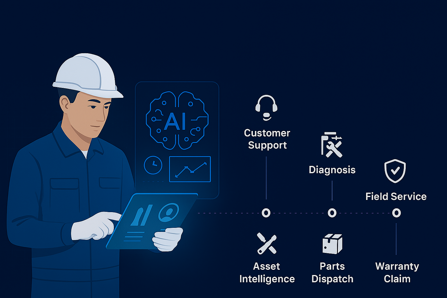
Why Executive Dashboards Are Central to Transformation Governance
Executive dashboards have become a central tool in modern transformation programs. Platforms such as Power BI and delivery tools like Jira allow leadership teams to view portfolio performance in near real time. But visibility alone does not create operational maturity. When dashboards are introduced before workflows stabilize, they expose inconsistencies faster than organizations can resolve them.
The Sequencing Problem in Dashboard Rollouts
There are two common rollout paths for executive dashboards.
1. Visibility First
- Build the dashboard.
- Turn it on.
- Mandate compliance.
- Clean up under pressure.
This creates immediate exposure, and reactive behavior.
2. Discipline First
- Define workflow standards.
- Align active projects.
- Clarify what qualifies as “red.”
- Sunset duplicate reporting.
- Then enable executive visibility.
This creates stability before exposure.

If Jira standardization begins while the Power BI dashboard is still being built, post-launch stabilization shrinks dramatically. What might otherwise require 90 days of reactive cleanup can compress to 30 days of controlled alignment.
The difference is not technology. It is timing.
This is particularly critical in large transformation programs where portfolio governance intersects with delivery velocity. As I’ve discussed in Why Service Revenue Remains Untapped, operational execution gaps often stem from design misalignment, not intent.
The same principle applies here.
Red Should Mean Risk, Not Imperfection
One of the most important design decisions in executive dashboards is the definition of “red.”
Red should indicate:
- Material impact to scope.
- Timeline risk.
- Budget exposure.
- Customer or operational consequence.
Red should not indicate:
- Incomplete documentation.
- Minor structural inconsistency.
- A Jira field that wasn’t updated yesterday.
If red is triggered by imperfection rather than risk, teams will prioritize cosmetic compliance over meaningful risk mitigation.
Over time, this weakens the signal. And when everything looks red, nothing stands out.
Good portfolio governance depends on signal quality. Binary systems require disciplined thresholds. Without them, executives gain visibility but lose diagnostic precision.
Key Insight
Executive dashboards should reflect operational discipline, not attempt to manufacture it. When visibility arrives before workflows stabilize, teams optimize for status indicators rather than actual delivery outcomes.
A Pattern Across Transformation Programs
This dynamic extends far beyond dashboards.
Across transformation programs, a familiar pattern often emerges: technology is introduced, metrics are exposed, and behavior is expected to align immediately. In practice, operational discipline usually takes longer to stabilize. Many service transformation initiatives stall at this stage, where early visibility and aggressive targets outpace organizational readiness.
Sustainable transformation follows a different order:
- Define standards.
- Stabilize workflows.
- Clarify risk thresholds.
- Then amplify with visibility.
When that sequence is reversed, pressure increases before maturity does.
In service operations, this often appears when performance dashboards are introduced before parts logistics are stabilized. In digital programs, adoption metrics may go live before training and process clarity are complete. In AI initiatives, performance reporting is sometimes exposed before data quality becomes consistent.
The tools are rarely the issue. Rollout architecture is.
Designing Better Dashboard Rollouts
For transformation sponsors, PMO leaders, and program managers, a few guardrails can reduce friction significantly.
Before Turning Visibility On
- Define and document workflow standards clearly.
- Clean active projects in Jira before exposure.
- Align stakeholders on what qualifies as red, yellow, and green.
- Plan the sunset of redundant reporting mechanisms.
- Communicate intent and transition timelines explicitly.
Immediately After Go-Live
- Use an initial calibration window.
- Separate reporting compliance metrics from delivery health.
- Monitor unintended workload increases.
- Adjust thresholds if red becomes overly sensitive.
Most importantly, avoid allowing governance tooling to become a parallel project.
Dashboards should reflect operational maturity, not attempt to manufacture it overnight.
Final Reflection: Visibility Amplifies the System Beneath It
Executive dashboards are powerful instruments in transformation programs. They enable portfolio governance at scale. They create transparency. They increase accountability.
But visibility accelerates behavior.
If discipline is not stabilized first, visibility accelerates tension. If risk definitions are unclear, indicators become controversial. If duplicate reporting persists, administrative drag increases.
Dashboards do not create discipline. They amplify the system beneath them.
Before turning the dashboard on, ensure the workflow is ready to be seen.